La BRAND
Founded in January 2021, FRINGUANT is revolutionizing the online fashion customer experience.
Their ambition is to transform the fashion industry using an innovative, intuitive, and secure body-scanning technology. Integrated directly into brand product pages, it helps consumers find the perfect size for every brand and every garment.
This solution enables fashion brands to reduce logistical costs caused by frequent returns, increase conversion rates, and lower their environmental footprint.
THE brief
The tool and website already exist. As a team, our task is to design a desktop version of the user journey, which currently only exists on mobile.
We are also asked to work on the user scanning screen (design and wording), while taking into account the technical constraints.
The context
Through E-artsup Paris, we had the opportunity to work with early-stage startups incubated at Station F.
Fringuant was one of them. This project was a group effort, I worked alongside Hugo Pradel and Eneko Londaitz, two design students from my class.
Our collaboration with Fringuant took place in two phases.
During the first week, we conducted an analysis of the existing user experience — which you can find on this page.
During the second week, we worked on a UI redesign of their interfaces — this UI project is available on another page.
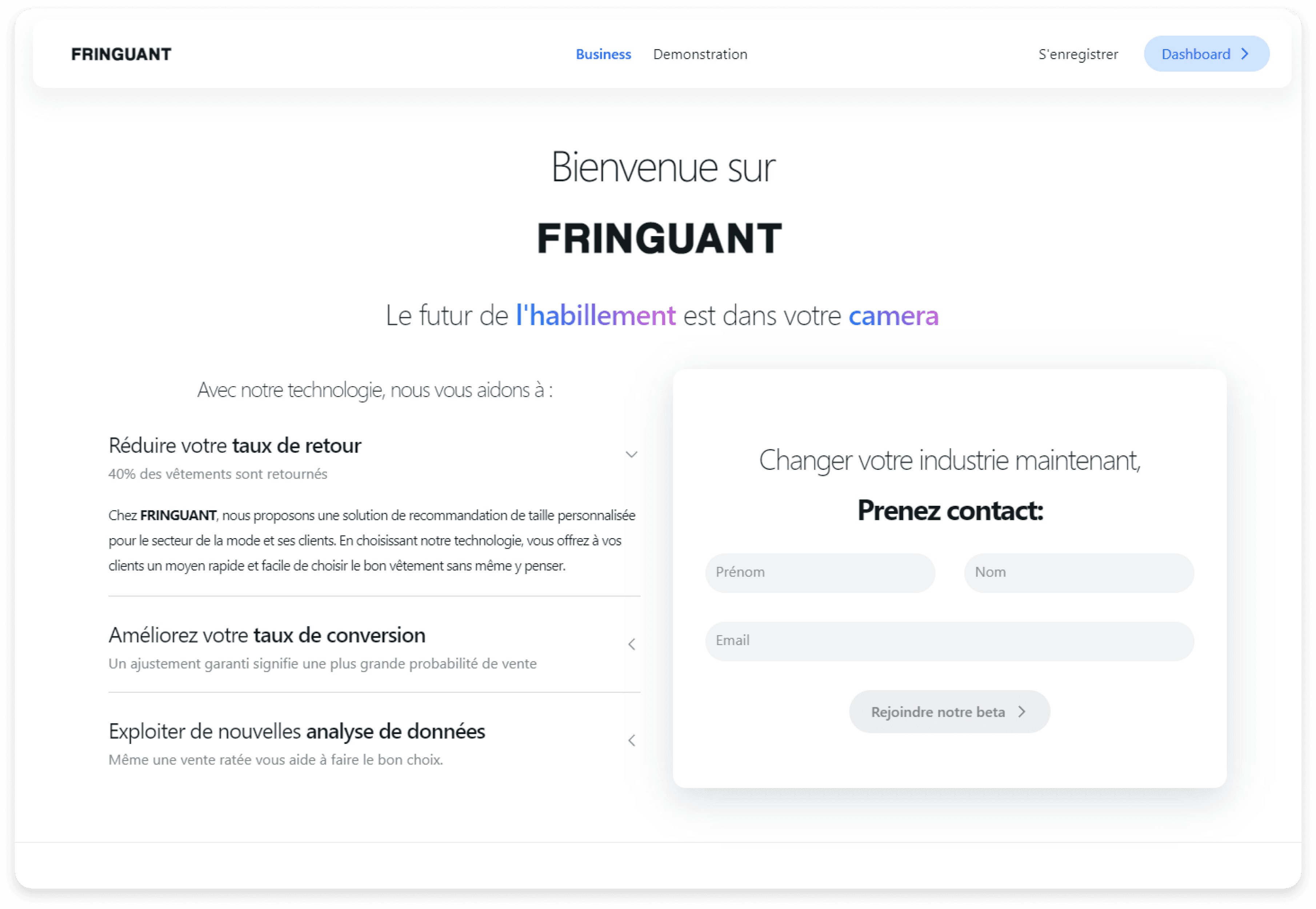
Following our UX audit, we identified the strengths and weaknesses of each page based on the four points listed below.
Readability
Cons- The hierarchy of text sizes and weights does not support readability.
Navigation
Pros + The dropdown menu effectively presents the uses of your technology.
Cons - Missing pages such as “Team”, “Our Solution”, “Contact Us”, etc.
ErgonomY
Pros + Information blocks are well organized.
Cons - No explanation of the technology, which products do you take into account?
Actions
Pros + Dashboard button is well designed.
Cons - The “Join our beta” button is not visually distinguishable from the input fields.
A typical day is used to illustrate the different steps and interactions users may have with the product. This model helps identify user behaviors, needs, and pain points.
In this case, the typical day focuses on purchasing clothing online. First, the user finds a garment on an e-commerce website, then asks Fringuant’s AI for assistance, and finally adds the product to their cart.
Impact mapping is a method used to clarify goals, identify stakeholders, define ways to achieve those goals, and determine success metrics. It helps focus efforts on actions with the highest potential impact.
In this case, the objective is to help users find clothing that perfectly fits their body shape and style preferences, in order to reduce returns to brands.
Here’s how impact mapping structures this approach:
Goal: The main objective is to reduce clothing returns by ensuring a better match between the products and customer expectations in terms of size and fit.
How?: This goal can be achieved by using artificial intelligence to scan users’ bodies, store their body measurements, and suggest suitable clothing. It may also involve adjusting clothing patterns based on data collected from users’ body shapes.
For whom?: The key stakeholders are online shoppers and online fashion brands. Both groups benefit from an improved shopping experience and lower costs related to returns.
Features: Possible features include applications that use body data to recommend clothes, virtual try-on for different fits, and data analysis tools to help brands refine their product offerings.
An Experience Map is a visual tool used to map out the complete journey of a user through a specific experience, including the different stages, actions, thoughts, and emotions involved. It helps understand and analyze the user’s experience and identify pain points.
In this case, we can observe that the main pain points occur when users are asked to accept the privacy policies, when they try to understand how the Fringuant tool works, and when they actually use it. Additionally, the question of personal data storage is particularly important for this tool, and this concern appears again as a recurring friction point during the body-scanning process.
An Empathy Map is a tool used to visualize a user’s attitudes and behaviors toward a product or service. It helps put yourself in the user’s shoes by outlining what they say, think, do, and feel. This makes it easier to understand their needs, desires, and pain points, and to design solutions that are more empathetic and effective.
As a first step in proposing a new visual identity, we suggest introducing new typefaces.
For the titles, we chose Montserrat Semi-Bold. This typeface was designed with strong consideration for readability, especially on digital screens. Its clean and simple shapes make text easy to read, even at smaller sizes. Montserrat is appreciated for its contemporary and elegant appearance, featuring balanced geometric forms and refined lines that give it a modern and professional look.
For the logo, we selected and customized Galins. Thanks to its shapes, this typeface can easily be associated with a brand in the fashion industry. It also conveys an elegant, high-end aesthetic, which aligns with Fringuant’s primary target audience.
For the color palette, we suggest using a slightly grey-tinted white for backgrounds and white elements. We also propose a slightly softened black for most text elements, except for highlighted text and a few background areas. Additionally, we recommend using an off-white as a background color to subtly distinguish different sections.
Finally, we selected a pastel blue. The goal is to evoke the visual identity of a tech tool, which aligns perfectly with Fringuant’s positioning. The tone is intentionally soft and pastel to avoid a design that feels too dominant — Fringuant acts as a white-label brand, and its interface and visual identity must be adaptable to those of its clients.
The main challenge in redesigning this interface was to make it clear and reassuring for the user, considering the sensitive nature of the data being requested.
Pour finir nous avons proposé un Dashboard utilisateur et marque. Ceci à pour but de fidéliser les utilisateurs à cette plateforme.
La plateforme utilisateur client propose de garder en mémoire dans une bibliothèque nos tailles pour toutes les marques et tous les types de produits qui sont proposés par ces marques. Dans ce dashboard client nous proposons également à Fringuant de mettre en avant des marques et des produits qui peuvent intéresser l’utilisateur notamment pour trouver des vêtements ressemblant ou se rapprochant de ses habitudes de consommation.
Dans le dashboard marques nous pouvons retrouver la proportion d’achat de différentes tailles de tous les utilisateurs, et les manières de porter chaque vêtement par leurs utilisateurs. En effet nous pouvons par exemple avoir l’information que pour tel produit les utilisateurs, à un certain pourcentage préfèrent le porter plus ample, ou au contraire plus prés de corps. Ces données peuvent êtres intéressantes pour la conception de nouvelles collections.


